Unibet Bet Builder
Bet Builder — combining selections into smarter bets
Designing a same-game multi-bet feature from requirements to shipped product — covering the contest page tool, betslip integration, popular widget, and responsive experience across native app, mobile web, and desktop.
Users were placing single bets on games they understood deeply. We weren't giving them a reason to go further.
Sports bettors — particularly football fans — often have nuanced reads on a match. They might back a team to win, expect a high-scoring game, and think a specific player will score. But placing those as separate singles is cumbersome and offers standard odds with no upside for combining knowledge.
Bet Builder (also known as Same Game Multi) exists to change that: let users combine contingent selections from the same match into a single, higher-odds bet. The business case was clear — more combinations, more engagement, better margins. The design challenge was making it feel intuitive in a UI already dense with information.

"How do you make combining bets feel natural — without turning the contest page into a configuration tool?"
As Product Design Manager, I led the cross-functional team responsible for the end-to-end experience: the in-contest Bet Builder tool, auto-detection in the betslip, the popular widget on the landing page, and the full responsive implementation across all platforms.
Knowing what to ship first was as important as knowing what to build.
The full Bet Builder vision included live betting, cash out, player-centric options, combo boosts, and dynamic price updates. Shipping all of that at once would have meant shipping nothing well. We defined a tight MVP scope and a clear post-MVP roadmap, presented to and agreed with stakeholders before a single screen was designed.
Two ways in. One coherent experience.
Users could reach Bet Builder from two distinct directions — actively, via the dedicated BB tab on the contest page, or passively, when the betslip automatically detected that bets they'd already added were combinable. Both paths needed to feel equally considered and equally effortless.

Five steps from discovery to placement.
The core BB journey followed a clear progression — but the design had to account for the fact that users could enter, exit, and re-enter at any point, with the betslip and contest page remaining in sync throughout.


All legs. One item. Full flexibility.
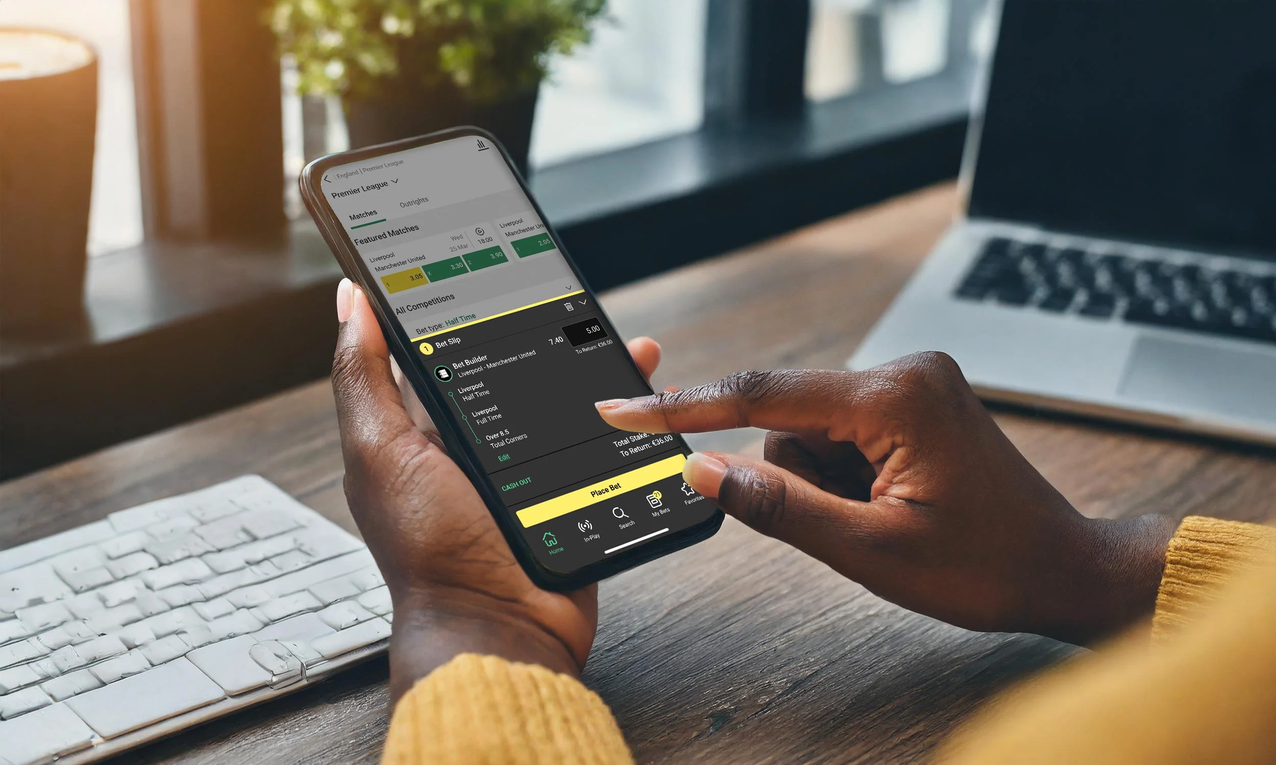
The betslip was the most complex part of the Bet Builder design — because it had to accommodate the new BB bet type alongside every existing betslip scenario: singles, multiples, rewards, odds changes, and conflicting same-game bets.
The core decision — treating the BB as a single bet item with stacked legs — was the right call both technically and conceptually. It kept the betslip readable, allowed BB bets to participate in multiples like any other single, and gave users a clean point of control for editing their selection.

The hard calls that shaped how it felt to use.
Bet Builder introduced interaction patterns with no precedent elsewhere in the product. Several decisions required weighing user clarity against business complexity — and in some cases, against each other.
| Decision | Rationale | Alternative considered |
|---|---|---|
| BB button animated on first visit, then collapses | Session-based animation draws attention to the new feature without becoming a permanent annoyance. Triggers on first scroll or tap — not on a timer. | Static tab — risks the feature being missed entirely by existing users not looking for it. |
| Incompatible bets greyed out, not removed | Greying out keeps users aware of what exists but can't be combined with their current selections. Context is preserved. | Remove incompatible options — cleaner visually, but users lose context and may not understand why options disappeared. |
| BB appears as a single item in the betslip | Multiple legs shown individually would fragment the betslip and break multiples logic. Single item preserves the bet's conceptual integrity. | Show all legs individually — creates visual chaos in slips with many bets and breaks formula multiples. |
| Show Singles checkbox rather than auto-splitting | The betslip auto-groups combinable bets, which could frustrate users wanting singles. An opt-in toggle preserves the BB while making singles available below it. | Always show both — doubles betslip length unnecessarily and creates confusion about which bets are active. |
| Odds decrease info message on certain additions | Some selections statistically reduce combined odds. Surfacing this transparently builds trust and lets users make an informed choice. | Block the selection silently — creates a frustrating experience with no explanation. |
| Popular BB widget always shows exactly 3 cards | Consistent count creates a reliable, scannable module. Card heights align to the tallest item, keeping the widget visually stable. | Variable count — makes the widget feel unstable and harder to design around on the landing page. |
Discovery on the landing page. Consistent across every screen size.
Beyond the contest page, the Popular Bet Builder widget gave users a way to discover pre-built BB bets directly from the sports landing page — tapping a card takes the user straight to the contest page with the BB pre-selected and the bet already in the betslip.

The full responsive design covered three platforms — native app, mobile web, and desktop — with the BB tool and betslip adapting layout and hierarchy appropriately at each breakpoint. The core interaction logic remained consistent across all three.

A new bet type that felt native from day one.
The full design system covered the BB experience across all touch points — contest page, betslip, bet receipt, My Bets, the popular widget, and responsive layouts for native app, mobile web, and desktop — including all edge cases: void legs, odds changes, conflicting bets, rewards, and multi-bet combinations.
The modular design approach — a standalone BB tool plugged into the existing betslip and contest page rather than replacing them — meant post-MVP features like live BB, cash out, and player-centric options could be added as incremental layers without redesigning the core experience.
