Case study / UX Concept & Consultancy
Redesigning the Skyscanner homepage to inspire, not just search
An independent consultancy project to reimagine Skyscanner's homepage — shifting it from a search utility into a travel inspiration platform that drives hotel and car hire upsell alongside flights.
UX Consultancy
Homepage redesign
Responsive design
Editorial UX
Service design
Competitor analysis
01 — Context & brief
Skyscanner had a search problem disguised as a homepage problem.
Skyscanner is one of the world's leading travel comparison platforms — known primarily for flights. But the business wanted to grow cross-sell revenue across hotels and car hire, and the homepage wasn't set up to support that ambition. It was a search form first and an experience second — optimised for users who already knew what they wanted, not users who were still deciding.
The brief for this consultancy engagement was to conceive and design a new homepage that would feel more like a travel brand and less like a search engine — while addressing several known product challenges around transparency, inspiration, and cross-sell visibility.
The brief
"Redesign the Skyscanner homepage to better upsell hotels and car hire, surface more inspirational editorial content, and integrate a social community layer — without losing the simplicity that makes Skyscanner trusted."
Objective
Turn the homepage into a platform for discovery — driving hotels and car hire alongside flights, and building engagement through editorial and social content.
Output
A fully designed homepage concept across desktop and mobile, grounded in research and service design — ready for stakeholder presentation.
02 — Research
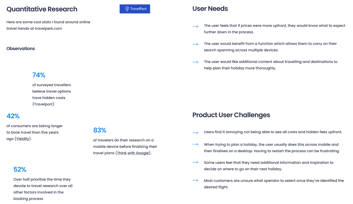
The data confirmed what the brief suspected — users needed more than a search box.
I began with a quantitative research phase, drawing on industry travel trends and consumer behaviour studies to establish the evidence base for the redesign. The findings validated the strategic direction clearly.
74%
of travellers believe travel options have hidden costs — transparency was a primary concern
83%
of travellers research on a mobile device before finalising travel plans
52%
prioritise time spent researching over all other factors in the booking process
42%
of consumers are taking longer to book travel than five years ago
User needs research surfaced three core requirements: transparent pricing visible before committing to a search, the ability to carry research across multiple devices, and more editorial content about destinations to support decision-making earlier in the journey.
Product challenge analysis identified four structural gaps in the existing homepage: most users only used Skyscanner for flights despite the broader offering; the homepage didn't encourage exploration; cross-selling was weak; and deals were not surfaced in a way that reflected the user's personal context.
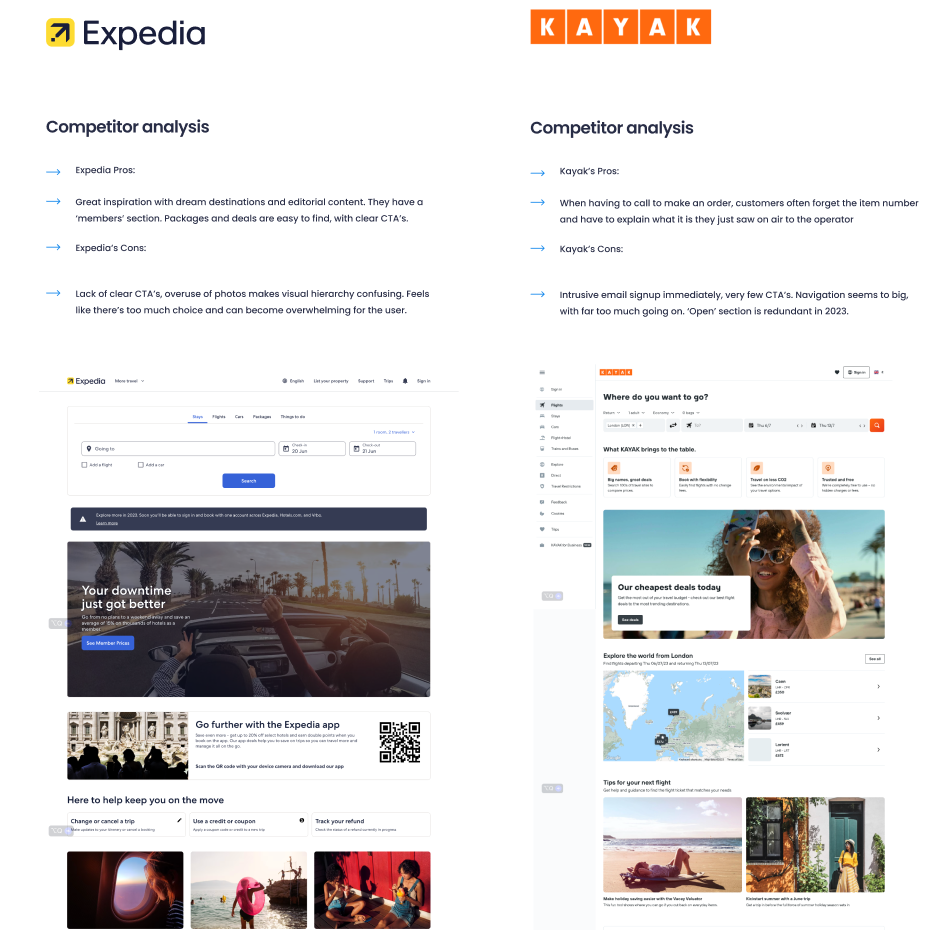
03 — Competitor analysis
Expedia and Kayak — learning from what worked and what didn't.
I conducted a structured competitor analysis of Expedia and Kayak — the two platforms most comparable in scope — to identify what Skyscanner could learn from and what it should deliberately avoid.
Expedia
Pro
Great destination inspiration and editorial content — imagery and deals are engaging and easy to scan.
Con
Lack of visual hierarchy creates confusion — too much choice becomes overwhelming for the user.
Kayak
Pro
Strong call to action on order — customers are guided clearly without forgetting where they are in the journey.
Con
Intrusive email sign-up immediately on entry. Navigation feels too big, with too much happening at once.
04 — Define
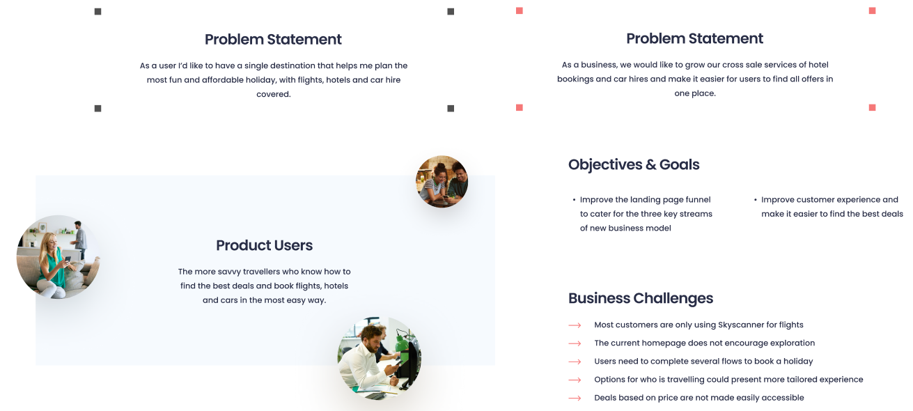
Two problem statements. One user, one business.
With the research complete, I defined the problem from both perspectives — the user's and the business's — to ensure the design solution served both without compromising either.
User problem
"As a user I'd like to have a single destination that helps me plan the most fun and affordable holiday, with flights, hotels and car hire covered."
Business problem
"As a business, we would like to grow our cross-sale services of hotel bookings and car hires and make it easier for users to find all offers in one place."
05 — Service design
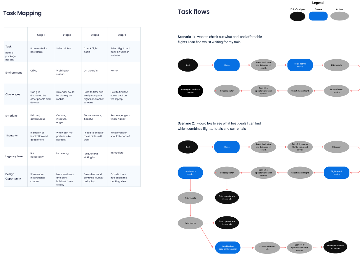
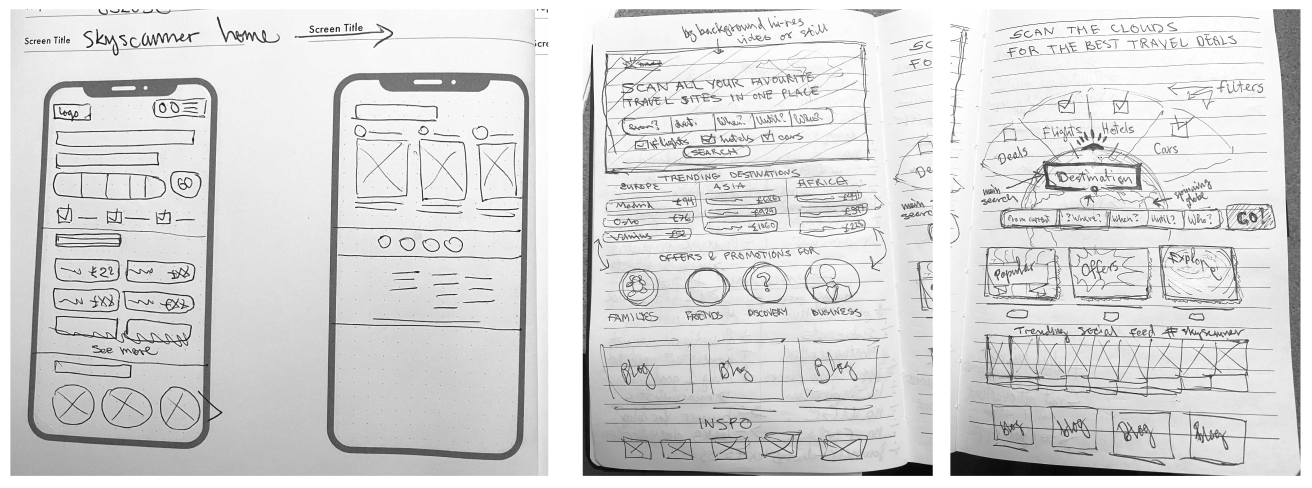
Task mapping, two user scenarios, and paper sketches before any pixels.
Before moving to the interface, I completed a thorough service design phase — mapping the tasks users perform across four steps, tracing two realistic user scenarios end-to-end through the product, and producing hand sketches to explore layout directions without committing to a visual direction too early.
Method 01
Task mapping
Mapped user tasks across four stages — from browsing to booking — including environment, challenges, emotions, and design opportunities at each step.
Method 02
Scenario 1 — Mobile search
A traveller checking affordable flights while waiting for a train — a high-distraction, time-pressured mobile context requiring speed and transparency.
Method 03
Scenario 2 — Holiday planning
A user planning a holiday combining flights, hotels, and car hire in one session — a deeper engagement flow requiring cross-sell and comparison support.
Method 04
Hand sketches
Multiple rough layout explorations covering the hero, search bar, destinations grid, traveller type filter, editorial, and social sections.
06 — Validation
Three wireframes. Twelve participants. One clear winner.
Before committing to high-fidelity design, I ran a structured usability testing round on three wireframe concepts — each representing a different approach to the homepage's content hierarchy and search placement. Testing wireframes rather than finished designs kept participants focused on structure and logic rather than visual polish.
"We needed evidence for which layout actually helped people discover hotels and cars — not just which one looked better."
Testing tool
Maze (unmoderated)
Participants
12 — regular travellers, 25–45
Method
5-second test + task flow + preference rating
Each participant was shown one of the three wireframe variants as a mobile prototype in Maze. They completed three tasks: identify where to search for a hotel, find a current offer or promotion, and locate travel inspiration content. Post-task, they rated their confidence and answered two open preference questions.
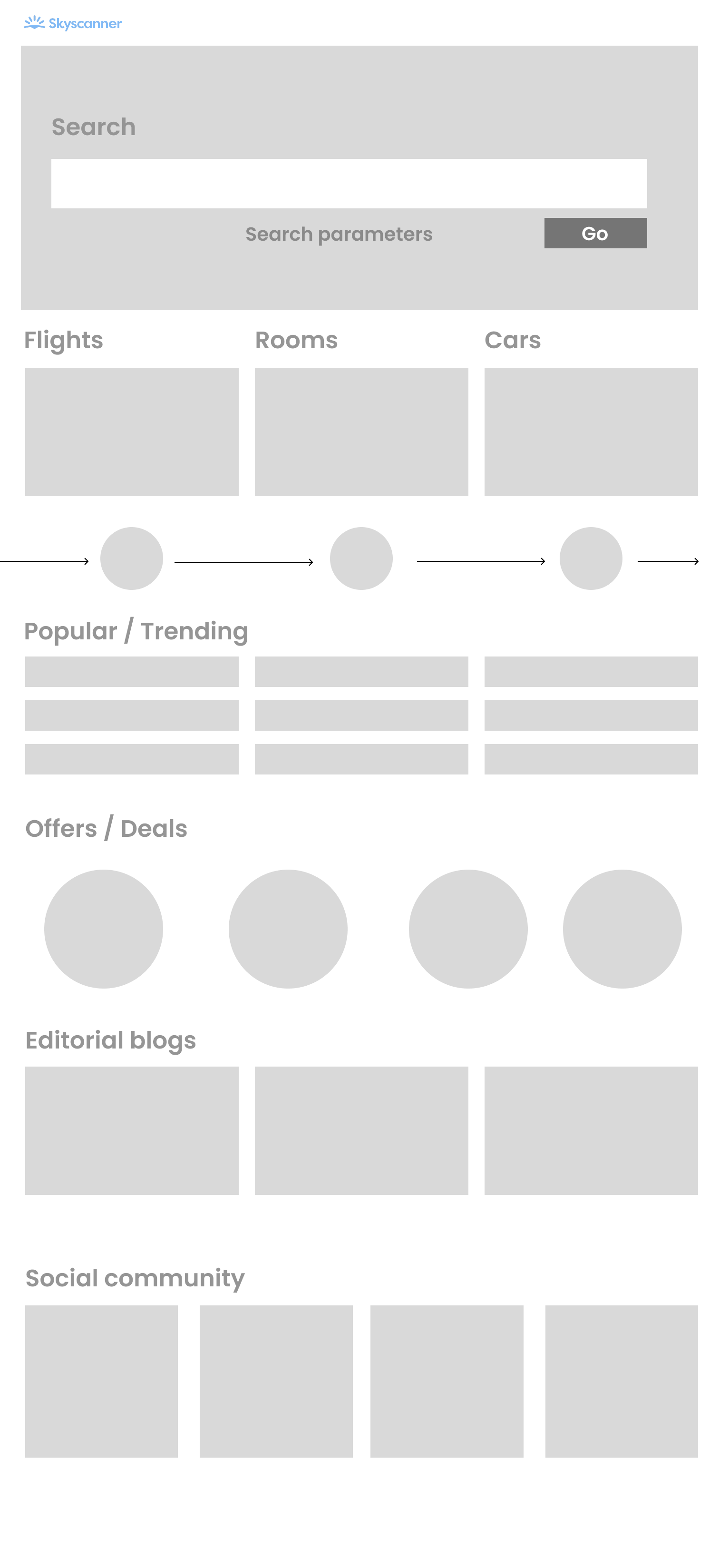
Wireframe variant A
Variant A — Search-led, promotions carousel
Mobile · 320px
Test annotations
11/12 participants identified the search bar immediately. Clear label and full-width input performed well on the 5-second test.
✓ Pass — 92%
2
Flights / Rooms / Cars journey bar
Only 5/12 noticed the journey bar. Icon-only format meant it was easily skipped — Rooms and Cars received almost no attention.
✗ Fail — 42%
Drew attention but 7/12 said "I'd scroll past it" — wide format with no visible text created confusion about what was being promoted.
~ Partial — 58%
All 12 found it. 8/12 said they'd only reach it on a second or third visit — felt buried beneath other sections.
~ Partial — 67%
Overall task completion — Variant A: 61% · Mean confidence score: 3.1 / 5
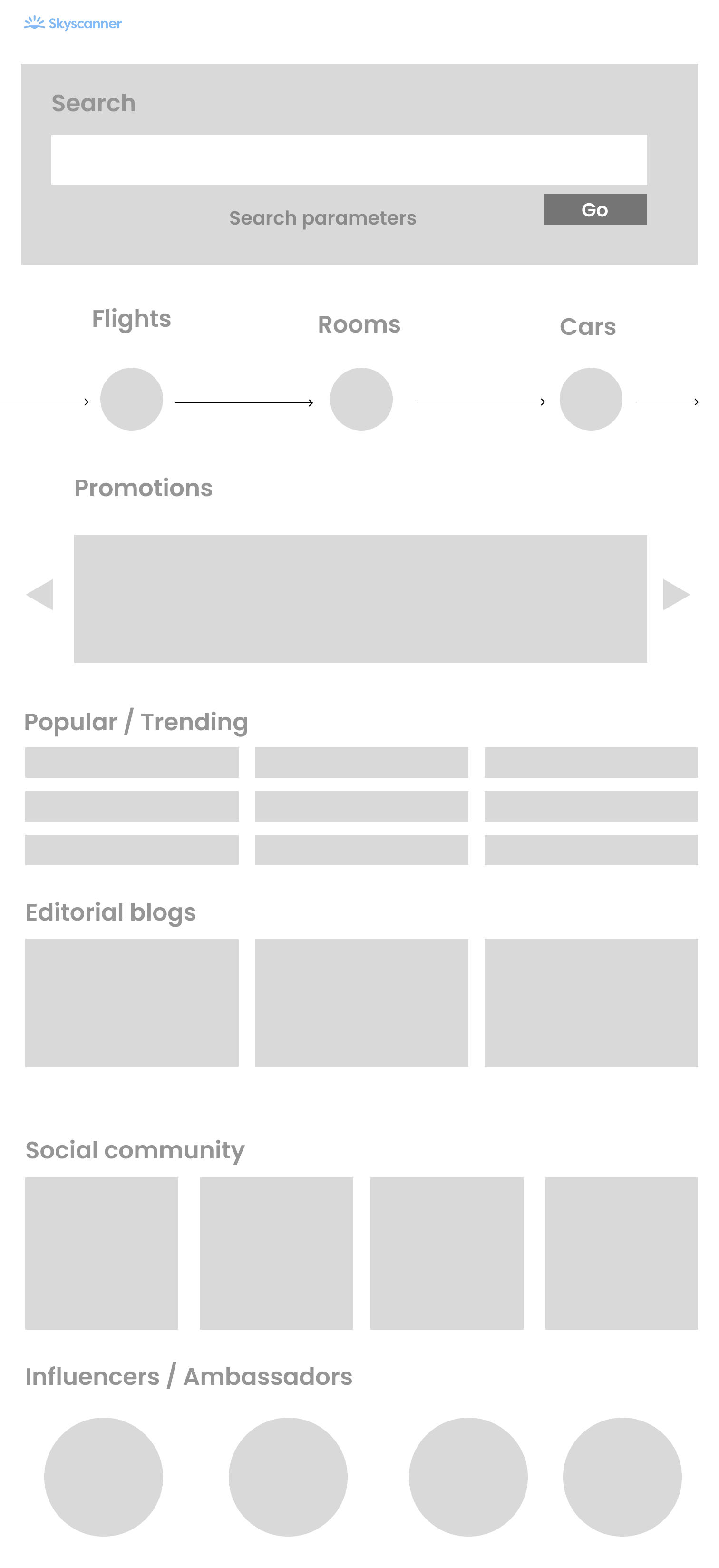
Wireframe variant B
Variant B — Equal-weight category images + offers by traveller type
Mobile · 320px
Test annotations
1
Flights / Rooms / Cars image cards
10/12 immediately identified all three categories. Image card format made Rooms and Cars equally visible to Flights for the first time across all three variants.
✓ Pass — 83%
2
Journey bar (below cards)
Felt redundant to 9/12 who had already understood the three-category structure from the images above. Suggested removing or repositioning.
~ Redundant — 75%
3
Offers / Deals — circle icons
8/12 said "I don't know what these circles represent." Concept was valued but execution needed labelling to be usable.
✗ Unclear — 33%
4
Social community section
11/12 understood this as a social feed. 9/12 said they'd engage if posts were from real travellers rather than brand accounts.
✓ Pass — 92%
Overall task completion — Variant B: 74% · Mean confidence score: 3.8 / 5
Wireframe variant C
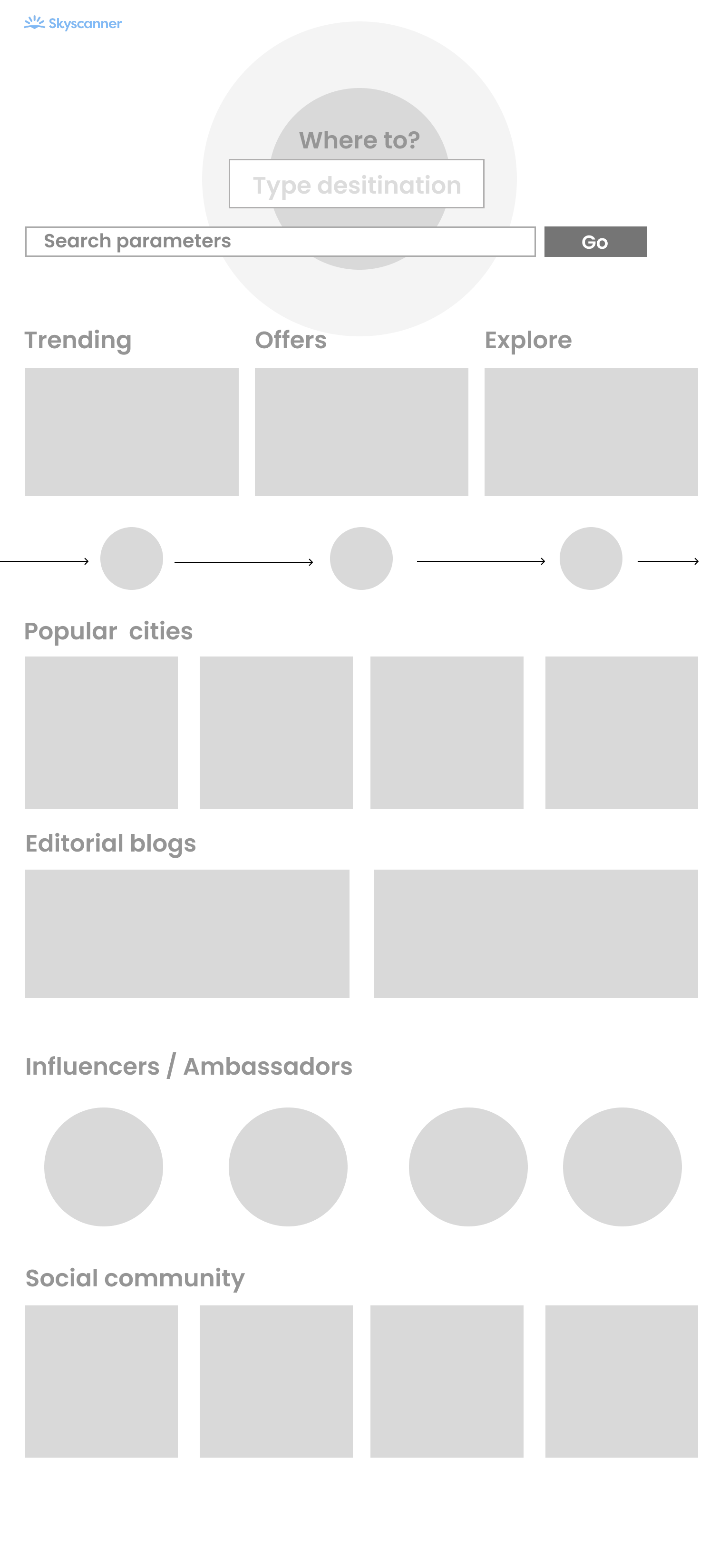
Variant C — Destination-first hero + discovery tabs
Mobile · 320px
Test annotations
1
"Where to?" destination hero
8/12 found it exciting. But 6/12 didn't recognise the globe as interactive, and 4/12 said it made Skyscanner feel flights-only.
~ Mixed — 67%
2
Trending / Offers / Explore tabs
Best-performing navigation pattern across all three variants. 11/12 correctly used the tabs to find offers and inspiration.
✓ Pass — 92%
10/12 said seeing city images with names inspired exploration. Strongest discovery moment across all three variants — participants lingered noticeably longer here.
✓ Pass — 83%
4
Influencers / Ambassadors
7/12 positive. 5/12 (particularly 35+) said "I'd ignore this" — felt like advertising rather than community content.
~ Partial — 58%
Overall task completion — Variant C: 79% · Mean confidence score: 4.1 / 5
What the tests told us — and what they changed.
Variant C returned the highest task completion rate and confidence score, but no single variant was universally stronger. The clearest signal from testing was that the best final design was a synthesis — taking the category image approach from B, the labelled tab navigation from C, and abandoning the icon-only approaches that failed in both A and C.
| Finding | Evidence | Design change |
|---|
| Hotels and Cars need image-led entry points |
Variant B image cards: 83% identified all three categories. Variant A journey bar: only 42%. |
Final design uses rich photography for each category card with equal visual weight. |
| Unlabelled icons do not work for offers |
Variant B circle icons: only 33% understood without labels. |
Traveller-type filter (Families, Friends, Solo, Business) uses imagery plus clear text labels. |
| Labelled tabs outperform carousels |
Variant C tabs: 92% task success. Variant A carousel: 58% — majority said they'd scroll past it. |
Promotions carousel replaced with a labelled category row in the final design. |
| Social content needs to feel real, not branded |
5/12 in Variant C said influencer format felt "like advertising." |
Final design uses a moderated UGC social feed with real travel posts, not influencer-first content. |
| "Where to?" globe was exciting but not understood |
6/12 didn't recognise the globe as interactive. 4/12 read it as flights-only. |
Globe concept removed. Replaced with a full-bleed hero image behind a unified search form. |
Validated ✓
Destinations grid inspires action
Popular cities grid in Variant C had the longest dwell time of any section across all variants. Confirmed: destination imagery drives exploratory browsing and directly supports the hotel and car hire upsell objective.
Validated ✓
Prices upfront reduce hesitation
Post-task: "Would you feel confident this site shows the full price?" Only 3/12 said yes for Variants A and B, confirming that visible "From £X" pricing was a trust-building requirement, not a nice-to-have.
Revised ↺
Journey bar was redundant twice
The journey bar appeared in all three wireframes and was effectively ignored each time. Testing confirmed it added no navigational value once the three categories were visible in the section above it. Removed entirely.
Revised ↺
Editorial needs more prominence
8/12 participants across variants said editorial content felt buried. Testing confirmed it needed to move up the page — leading directly to its repositioned placement in the final design.
→
Category imagery (from Variant B) applied to all three service cards in the hero section of the final design.
→
Labelled tabs (from Variant C) adopted for offer and content navigation, replacing the failing carousel pattern.
→
Journey bar removed entirely — testing confirmed it provided no value once category images were present.
→
Prices added to destination grid — testing confirmed visible "From £X" pricing was a primary trust signal, not optional content.
→
Social feed reframed as community UGC — directly responding to "feels like advertising" feedback in Variant C.
→
Editorial section moved up the page — 8/12 participants said it felt buried at the bottom of all three wireframe variants.
07 — The design
A homepage that earns the full travel planning session — not just the flight search.
The final concept was built around a single organising principle: every section of the homepage should give the user a reason to stay and explore, not just search and leave. Each module addresses a specific user need identified in research, while simultaneously supporting one of Skyscanner's business objectives.
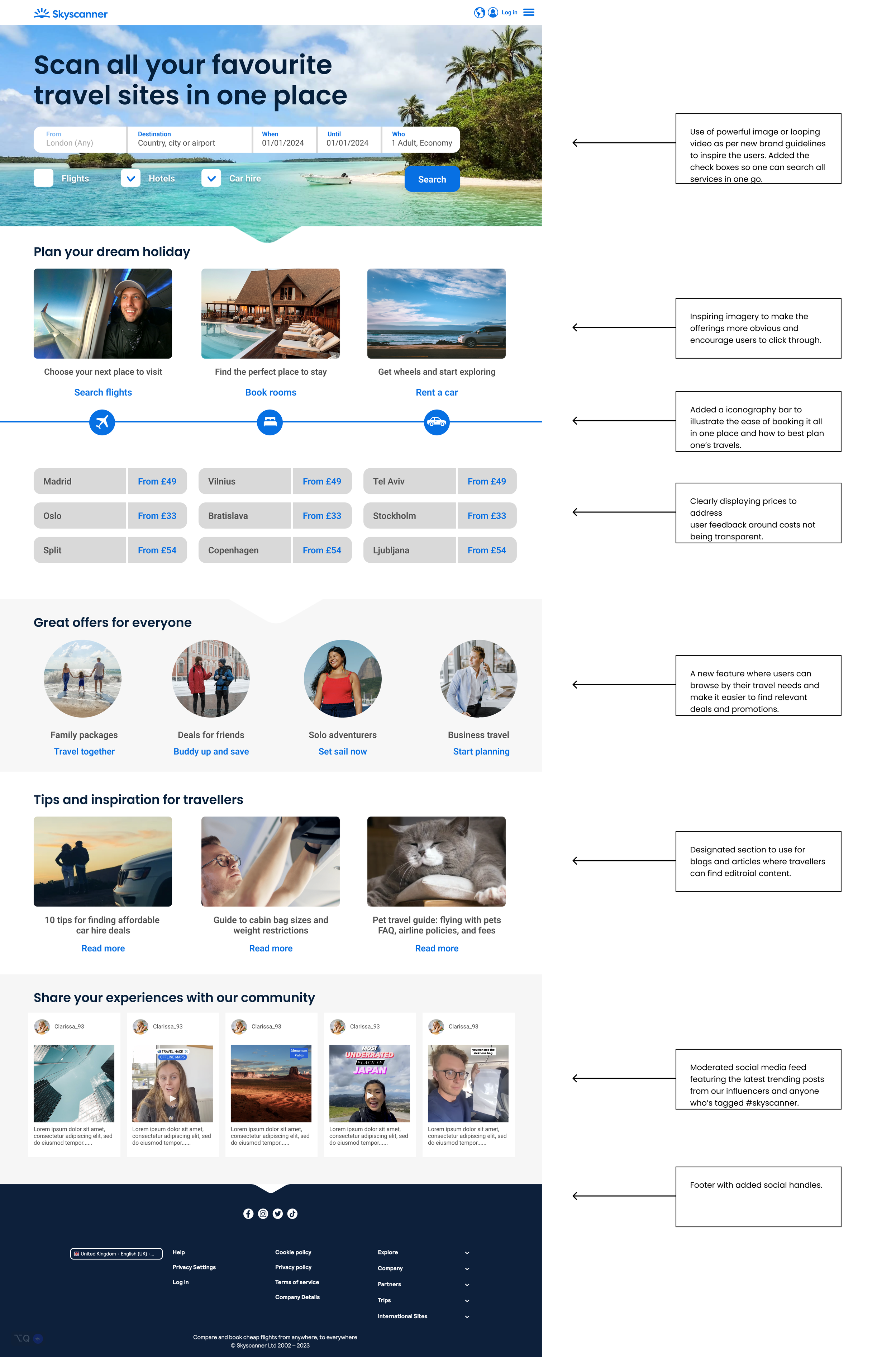
01
Hero — full-bleed imagery with unified search
A powerful hero image or video following new brand guidelines, with the search form redesigned to include Flights, Hotels, and Car Hire as a unified one-go experience — making cross-sell the default, not an afterthought.
02
Plan your dream holiday — visual category switcher
Replaced icon tabs with rich photography for Flights, Hotels, and Car Hire — making the three revenue streams equally prominent and visually compelling, validated by Variant B testing which showed 83% category recognition vs. 42% for icon-only.
03
Trending destinations grid — with prices upfront
A 9-destination grid with prices clearly displayed from the start — directly addressing the 74% of users who distrust hidden costs, and a direct response to testing which confirmed pricing as a primary trust signal.
04
Great offers for everyone — traveller-type filter
A personalisation layer letting users browse by travel identity — Families, Friends, Solo adventurers, Business. Each filter surfaces contextually relevant deals. Labelled following the Variant B icon test failure.
05
Tips and inspiration — editorial content section
A dedicated editorial module for travel guides and destination articles — repositioned higher on the page after 8/12 test participants said editorial felt buried in all three wireframe variants.
06
Share your experiences — community social feed
A moderated UGC feed featuring real travel posts tagged #skyscanner — framed as community rather than influencer content, directly responding to the "feels like advertising" finding from Variant C testing.
08 — Key design decisions
Every change was grounded in something the research said.
| Decision | Rationale | Alternative considered |
|---|
| Unified search bar — Hotels and Car Hire alongside Flights by default |
Most users only used Skyscanner for flights despite the wider offering. Making the other services equally accessible in the primary search form removes the friction of discovering them separately. |
Keep flights-first with tabs for other services — preserves existing behaviour but misses the cross-sell moment entirely. |
| Rich photography for category switching — not icon tabs |
Flights, Hotels, and Cars as images creates an aspirational feel and makes the full offering more visually equivalent. Validated by testing: 83% recognition vs. 42% for icon-only. |
Icon-based tabs — functional but cold, and implicitly positions Hotels and Cars as secondary to Flights. |
| Prices shown upfront in the destination grid |
74% of travellers report concern about hidden costs. Displaying "From £X" prices prominently builds trust before the user has even begun a search. Directly confirmed by testing. |
Prices revealed on hover or after search — reinforces the hidden-cost perception the research flagged. |
| Traveller-type filter — labelled, not icon-only |
Variant B testing showed 33% comprehension for unlabelled icons. Labelled filters (Families, Friends, Solo, Business) make promotions feel relevant and personal — a direct response to the test failure. |
Static promotional cards — simpler to build, but low relevance to most users at any given time. |
| Community social feed as a homepage section |
83% of travellers research destinations before booking. A social feed keeps that research on Skyscanner. Framed as UGC rather than influencer content following Variant C feedback. |
No social layer — cleaner, but cedes the social discovery moment entirely to external platforms. |
| Editorial content repositioned higher on mobile |
Mobile research confirmed users value content that helps them decide. 8/12 test participants said editorial felt buried in all wireframe variants — repositioned in the final design as a direct response. |
Search-only mobile experience — optimised for speed, but misses the majority of mobile users who aren't yet ready to search. |
09 — Reflection
What I'd do differently.
What worked
Running the full service design process before touching the interface. The task mapping and scenario work surfaced insights — particularly around the mobile research journey and hidden-cost anxiety — that shaped the design in ways no amount of visual exploration would have. The research made every decision defensible.
What worked
The wireframe testing round. Testing three layout concepts before committing to high-fidelity design meant the final concept was a synthesis of what actually tested well — not what looked best on screen. The icon failure in Variant B and the globe confusion in Variant C both directly improved the final design.
What I'd change
In a consultancy context with limited time, testing of the final high-fidelity design wasn't possible. In a longer engagement, I'd have wanted to run a second round on the finished concept — particularly to validate the traveller-type filter interaction and the community social section at higher fidelity before stakeholder presentation.
What I learned
Homepage redesigns are deceptively difficult — every module competes for priority and every stakeholder has a preferred section. The service design phase gave the concept its structural logic. The testing gave it its evidence base. Together, they made the final design significantly harder to challenge than a purely aesthetic direction would have been.